This portfolio is new enough that almost nobody has seen it yet. But sooner or later a recruiter is going to open it, and I like to imagine the small pause on the other end. Hard black borders. A pixel wordmark with a sparkle in it. Blue links that turn purple after you click them. A webring in the footer. It looks like a member profile page from a forum that stopped existing twenty years ago, and the obvious explanation is nostalgia.
The obvious explanation is wrong — or at least, it is a footnote.¹ The real explanation is that the dense, table-driven, everything-visible web never actually died. It just stopped being Western. And I spend enough evenings inside the version that survived to know exactly how good it still is.
Where I actually browse
My idea of a decent evening includes trawling Yahoo! Auctions Japan. Not a preserved museum copy — the live site, right now, one of the biggest auction platforms in the world:

Look at what this page is willing to do. A promo carousel yelling about PayPay points. A coupon notification with a little treasure chest, sliding in over the content. A row of brand thumbnails. Red banners with percent signs in a font size Western design systems would classify as a workplace incident. And underneath all of it, a layout that is fundamentally a table of things, because an auction site is a table of things and ヤフオク has never pretended otherwise.
And then there is Mandarake, Japan's legendary secondhand anime and manga empire, whose corporate tagline is — I am not making this up — RULERS OF TIME. Their mail-order shop runs on the same DNA:
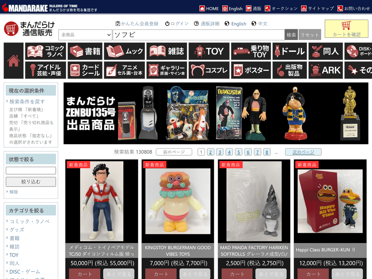
Two solid rows of category tiles — comics, books, mooks, magazines, toys, dolls, doujinshi, anime cels, cosplay, posters — a filter sidebar, and a search that cheerfully reports 130,808 results for one keyword before laying them out as cards with yen prices and cart buttons. There is no full-viewport hero, no tagline about reimagining collectibles. The page is the inventory, because Mandarake understands what a collector actually wants: to see everything, immediately, and be trusted to filter it themselves. It is the fan-shrine web all grown up — the same obsessive cataloguing energy as those old episode-guide pages, except now it has a warehouse behind it.
Spend enough time on these sites and something recalibrates. You start noticing how much of the Western web is stalling — hero, tagline, scroll, fade-in, scroll, three feature cards, scroll, finally a link. Then you open a page that respects you enough to just show you everything, and the stalling starts to feel like what it is: a decision that the brand's mood matters more than your time.
The web where 1999 never ended
This is not just a commerce quirk. It is the whole Japanese web. Here is Yahoo! Japan today — not the Wayback Machine, today:

While American Yahoo shriveled into a news feed, Yahoo! Japan stayed a portal: a directory of services down the left, a ranked news module in the middle, weather on the right, text links everywhere. Or take kakaku.com, one of Japan's biggest price-comparison sites, whose homepage is essentially a category directory with better icons:
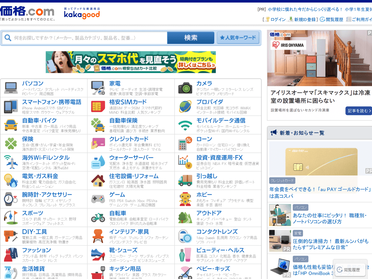
By Western standards this is a crime against whitespace. By its own standards it is deeply respectful of the user: every category, every subcategory, every service is one click away and visible right now. Nothing hides behind a hamburger, nothing fades in on scroll, and the page assumes you can read faster than you can scroll — which you can.
People argue about why Japanese web design held this line — compact kanji that stays legible at small sizes, the i-mode mobile era, a culture where a dense page reads as trustworthy and a sparse one reads as empty. Whatever the cause, the result is a parallel timeline where information density kept winning. The West treats 1999 as an aesthetic to escape; Japan treated it as a foundation to refine, and a quarter century of refinement later, ヤフオク and Mandarake and kakaku.com are the proof that density was never the bug.
For the record, here is the shared ancestor — Yahoo's actual homepage from October 1999, when the front door of the entire internet was a hand-curated directory:
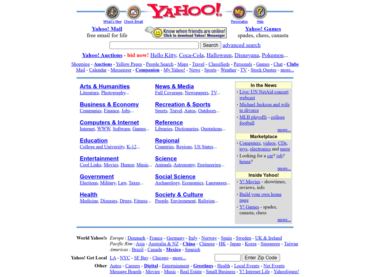
Dense, almost entirely text, instant on a 56k modem, and you never once wondered where to click. One branch of the web kept building on this. The other branch decided it was embarrassing. My site takes sides.
The Western holdout: McMaster-Carr
To be fair, the West kept exactly one of these sites, and it kept the best one. McMaster-Carr is an industrial supply company that has been selling fasteners since 1901, and its catalog site is the stuff of legend — both among machinists who need one specific screw out of seven hundred thousand parts, and among web developers who cannot explain why a hardware catalog loads faster than their React app:

The design could not be simpler: a category list down the left, product families as rows of neat grayscale illustrations, a search box, and nothing else. No campaign banners, no seasonal rebrand, no hero image of a smiling machinist. It has looked essentially like this for decades, because a machinist mid-repair does not want a brand experience — they want the shim, and McMaster's entire interface budget is spent on the distance between "I need a shim" and the shim.
And then there is the speed, which is what made the site quietly famous. Every performance teardown of mcmaster.com finds the same boring answers: server-rendered HTML, critical CSS inlined, the next page prefetched the moment your cursor drifts toward a link, a service worker caching everything cacheable. No framework worship, no clever architecture diagrams — just twenty years of sweating the fundamentals until clicking around a 700,000-part catalog feels instant.
I can offer my own measurement, with a caveat that makes it funnier. When I loaded the site while writing this post, its bot detection decided my automated browser looked suspicious and served me a login wall instead of the catalog. That login wall was a 14 kB HTML document, ~116 kB transferred in total, first paint in 576 ms. Their rejection page has better performance numbers than most companies' landing pages. (The catalog screenshot above comes from the Internet Archive, where the front door is still open.)
McMaster matters to this argument because it proves the thesis is not a Japanese cultural quirk. An industrial supplier in Illinois and a collectibles empire in Nakano reached the same conclusion independently: when the job is helping someone find one thing among hundreds of thousands, density and speed beat decoration, every time, on every continent. It is the single site I think about most when I strip something out of my own.
GlitterNet, the design system
So the whole thing runs on a small design system I call GlitterNet (every class is prefixed gn-). The organizing idiom is the member profile page: a pixel wordmark masthead, a two-column layout with a profile card on the left, panels with colored title bars, thread-row tables for lists, and a webring footer. My homepage literally introduces me the way a forum would: avatar, handle, role, a little stats table. That is as much 2000s Japanese BBS as it is GeoCities — the thread-row table is the single most battle-tested layout in the history of the internet, and both lineages agree on it.
The visual language reduces to a handful of hard rules:
| Rule | Implementation |
|---|---|
| No rounded corners | border-radius: 0, globally, forever |
| Hard edges | 2px solid borders on everything that matters |
| Sticker shadows | box-shadow: 2px 2px 0 — offset, zero blur |
| Pixel type is display-only | VT323 at 22px+, never body text |
| Links look like links | blue, underlined, and yes, visited links turn purple |
| Density is respect | small body type, tight spacing, everything visible |
The zero-blur shadow is the single highest-leverage trick in the whole system. A modern drop shadow is soft and diffuse and says "material design." A hard offset shadow says "sticker slapped on a page," which is exactly the energy a profile card wants. Buttons take it one step further: on :active the shadow disappears and the button translates by the same 2px offset, so it physically presses down into the page:
.gn-btn {
  border: 2px solid $brown-6;
  border-radius: 0;
  box-shadow: 2px 2px 0 $sand-3;

  &:active {
    box-shadow: none;
    transform: translate(2px, 2px);
  }
}
Typography is a two-font system where only one font is real. Display text is VT323, a pixel font, and it is the only webfont on the site. Body text is Trebuchet MS — the most late-90s font stack imaginable, and it ships in the operating system, so body text costs zero bytes of font download. The root font size is clamp(8px, 2.5vw, 10px) so 1rem ≈ 10px, which makes the dense 13px-body-text forum look easy to reason about and lets the whole layout scale down smoothly on small screens.
The part the old web got wrong
Real y2k sites — East and West — were gloriously inaccessible. Lime text on tiled backgrounds, navigation inside image maps, contrast as an afterthought. That part I did not keep. The density here is period-correct; the engineering underneath is deliberately modern.
The palette is a high-contrast system: pure black surfaces with white text and bright green/cyan accents in dark mode, pure white with darkened accents in light mode — Windows High Contrast energy, but tuned so every accent-on-surface and text-on-fill pairing holds up. All colors live as --gn-* custom properties on :root, and the SCSS variables the components use just point at them, so the entire theme swaps at runtime without touching a single component style.
Dark is the default. The OS preference flips it via prefers-color-scheme, a header toggle overrides both via a data-theme attribute, and — the detail I care about most — a tiny inline script in index.html resolves the theme before first paint:
<script>
  var t = localStorage.getItem('theme');
  if (t !== 'light' && t !== 'dark') {
    t = matchMedia('(prefers-color-scheme: light)').matches ? 'light' : 'dark';
    localStorage.setItem('theme', t);
  }
  document.documentElement.setAttribute('data-theme', t);
</script>
No flash of the wrong theme, ever. The first frame you see is already yours. There are also visible focus rings on everything interactive, and prefers-reduced-motion collapses all animation for anyone who asks — not features the old web offered, on either continent.
Looking like 1999, loading like it too
Here is my favorite irony: styling a site after the dense web makes it fast, because the aesthetic forbids everything that makes modern sites slow. No hero videos. No parallax libraries. No 400 kB of font families. Flat colors, hard edges, and text — the exact things that compressed well over a 56k modem — compress just as well over HTTP today.
The concrete numbers, from the production build:
- ~101 kB total initial transfer (359 kB raw), for the whole Angular app.
- 9 kB of CSS. The entire GlitterNet design system, both themes included.
- Every page prerendered to static HTML at build time via Angular SSR — including this post — so the first paint is plain HTML, no waiting on JavaScript to see the page.
- Heavy dependencies are lazy chunks: Mermaid and KaTeX only download if you open a blog post that actually renders a diagram or an equation. The homepage never pays for them.
- One webfont, loaded with
display=swap, so text renders immediately in the fallback and upgrades to pixels when VT323 arrives.
A page styled after 1999 that ships a hundred kilobytes is, by modern standards, an act of aggression. The median web page today is over twenty times that. Mandarake would understand. McMaster-Carr would ask why it took me this long.
A site should be somebody's
The deepest thing the dense web gets right has nothing to do with kilobytes. Yahoo! Auctions feels like ヤフオク and nothing else. Mandarake feels like a basement full of treasure with a search box, because that is what it is. And the old personal web — the fan shrines, the guestbooks, the hit counters proudly displaying four digits — felt like people, one page at a time. Sites were rooms that belonged to someone.
So this site is mine. The sparkle in the wordmark, the webring in the footer, the profile card that introduces me like a forum member — dense like the pages I actually spend my evenings on, built with the engineering I use at work. The borders are hard, the shadows do not blur, the links turn purple, and the whole thing still loads before your coffee order is wrong.
Sign the guestbook on your way out. (The guestbook is the ✉ find me panel on the homepage. Some compromises were made.)
¹ About that footnote. I was born in 1997, which means I technically missed the 1999 web — but I grew up in a small town, and small-town computer labs run years behind. I learned the internet on beige machines running Windows 98 and XP, on CRT monitors deep enough to keep a sandwich warm, browsing anime fan pages that were already old and still perfectly good. The y2k web reached me the way most things reach small-town kids: as a hand-me-down. The nostalgia is real. It is just not the argument.